If the only metric you use for measuring and forecasting your team’s progress is their iteration velocity, you’re missing out on a great deal of richer information that, for just a few extra minutes per day, you could easily be collecting. This is information that the team can use during the iteration to help spot and fix problems that are holding them back.
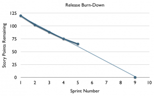
If you’re using scrum, you’re probably familiar with using a Release Burndown chart to track the team’s progress, iteration by iteration, towards a bigger goal:
Here we can see the team’s velocity appears to be slowing down. They might still release at the end of Sprint #9, but there’s a chance, if the flattening trend in their velocity continues to worsen, that they may never finish the project at all.
We have enough information here to know that something may be wrong. We can use this information to warn stakeholders that our release date may be at risk of slipping, and may also start looking though the backlog of stories for things we can drop.
The problem with these responses is that they’re purely reactive. Assuming there is a systemic cause at the root of this slow-down, we’re not doing anything to deal with it and get the team back on track. We can go and ask the team what they think might be wrong, and try to help them correct any problems they can identify. This can often work, but sometimes the team may not have the experience or perspective to be able to see what’s going wrong.
Another problem is that we’ve had to wait until the end of the iteration to get this information. For an organisation that’s used to going into the darkness of 9-month waterfall projects, getting iteration velocity figures once a fortnight can see pretty decent. An awful lot can happen inside an iteration though, and having that summed up by a single number loses a lot of important detail. Like the signal on an old short-wave radio, this is low-fidelity data.
One crucial piece of data that’s hidden within the burn-down chart is what I call the rate of discovery. The whole point of agile development is that it’s iterative: we build and ship something, get some feedback, learn from that, build and ship some more, and repeat until our stakeholders are happy with it. If we’re doing iterative (as opposed to repetitive) development, we’re going to discover new user stories as we go through the project, perhaps even as we go through the iteration. This is a good thing: it means we’re listening to our customers. We need to make sure our project plans can handle this as a matter of course.
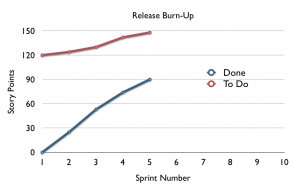
Going back to our release burn-down, we want to separate the rate of discovery from the rate of delivery. A great way to do this is simply to flip the vertical axis of the chart, and use a Release Burn-Up instead. On here we can start tracking two lines instead of one. First we draw the number of completed stories (or story points), and then stacked on top of that, we draw the number of stories still to do. That includes any story not yet done – whether it’s in the backlog or being worked on in the next iteration.
I love these charts – they seem to easily map to people’s understanding of the project. When you explain that the area underneath the bottom line represents all the features that have been done, it’s easy for anyone involved with the project to quickly understand what it means. In the case of the chart above, we can identify that while the team are delivering at a pretty steady rate, they’re discovering features at a steady rate too. They’ll probably need to de-scope if they want to meet their release date.
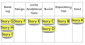
We can add extra fidelity to this chart in two dimensions: We can collect samples more often, and we can collect details about just how done the stories are as they move from ‘not done’ into ‘done’. Let’s start by collecting more detail about how done the stories are. Imagine our task board looks like this at the end of an iteration:
One story (Story A) is done, and 8 other stories are not done. As we track these counts over time, we can draw one line on our Release Burn Up chart for each category of ‘not done’ and stack the lines:
This chart has another name, Cumulative Flow Diagram (CFD). We call it this because as stories flow from ‘not done’ to ‘done’ across the task board, we’re drawing the accumulation of that flow on the diagram. There are lots of things we can gleam from this diagram.
If we look at the example above, we can see that work is stacking up in the design stage of our process. Because our CFD chart highlights this, we can put more directed effort into relieving the bottleneck on the designers, perhaps by adding an extra analyst to the team to run ahead and do some more detailed analysis of the upcoming stories in the backlog, or by helping the designers to break the existing stories up into smaller ones that are easier to understand.
You can wait until the end of the iteration to count these numbers, but why stay ignorant? If you collect this data every day, you’ll get quick feedback about where bottlenecks are appearing in your team, and be able to try small tweaks to correct them.


Great article, Matt.
I wrote a little tool that can help in creating a CFD that you can read about here: http://open.bekk.no/2009/11/03/cumulative-flow-diagrams-with-google-spreadsheets/